Sept 15, 17 — Letter and spirit...
Clearly there is much more going on in typefaces than meets the eye.
— Douglas Hofstadter
Typography has always been influenced by technology, and vice versa.
All typefaces have a history. When we use them as designers, we should have this history in mind. It should contribute to why we are using that specific typeface.
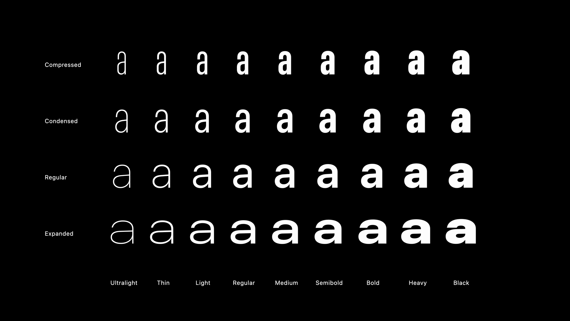
What’s the difference between serif, sans serif (geometric, humanist), monospace, and display (e.g. blackletter)typefaces? What is an example of each? What is each good for?
Typefaces are like visual tone. It’s like choosing the voice or accent or affect you want your text to have.
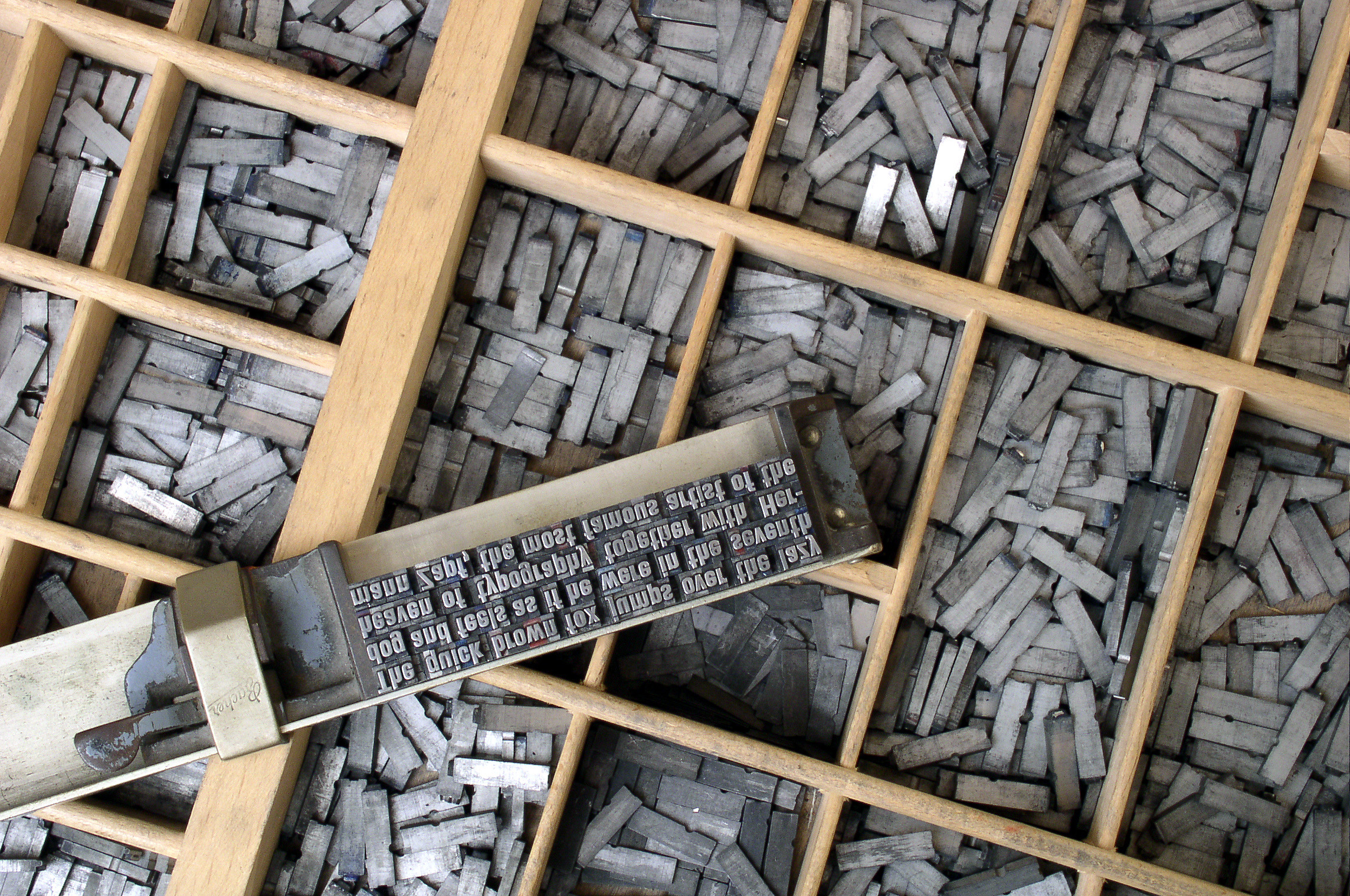
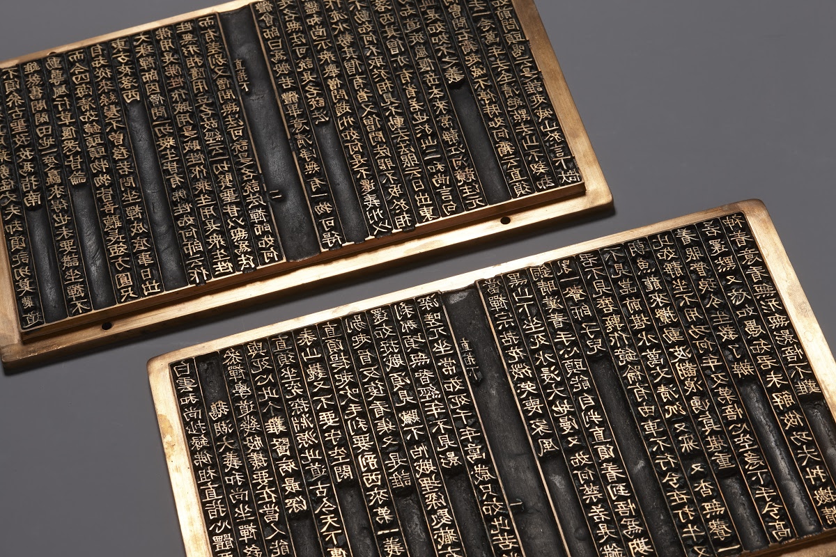
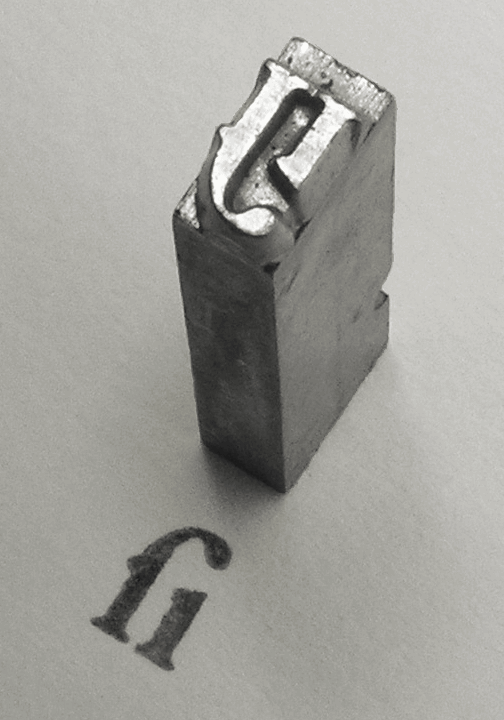
As we mentioned, typography always has a direct relationship with the technology of the time. The technology metal movable type was created in the 1400s in Europe, and much earlier during the 1000s in China to spread the written word.
What about today? What is going on with typography today?
Speaking of technology, by the way, there's a risography workshop this Friday. Don't riso text under 9pt size. Enjoy the colors! Learn more and sign up...
Continued in class...
Readings
Read:
- “The Page” from Species of Spaces by Georges Perec (1974)
- “The Concept of a Meta-Font” by Donald Knuth (1982)
- “Letter & Spirit” by Dexter Sinister (2010)
Questions:
- How might you use a meta-font in your life? Share at least three examples in your everyday life in which it might be useful, and why.
- What innovations in typography do you imagine happening in the near future? Why?
Resources
- CSS Basics Video
- Why is CSS so Weird? Video
- Fruitful CSS Basics Guide 🍊
- Fruitful CSS Layout Responsive Guide 🍊
- cssreference.io
- Riso Fox Fridays Workshop, 9.19
- Laurel’s favorite fonts
Assignments
- Visual Texts (Continue)
- 25 Variations (Continue)